Challenge: Working professionals and students who want to meditate are overwhelmed by the current platforms online. They have too much content, are not to the point, and do not provide mindfulness geared toward productivity and stress elimination.
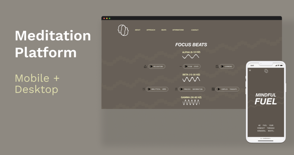
Solution: Mindful Fuel website to be user-friendly by providing simple, clear navigation and offering a simplified way to find meditative sounds to improve productivity and state of being.

Role:
- UX/ UI Designer
- UX Researcher
Project Duration:
- September – November 2022
Responsibilities:
- User Research
- Wireframing
- Prototyping
- Testing
- Designing
Software used:
- Adobe XD
- Photoshop
Research
I initially started the research process by conducting interviews to understand the users’ behaviors for the age group of 18-38. The process took 30-45 minutes as I walked through a series of 35 questions that uncovered the psychology of the individual and their usability habits. They ranged from topics as below:
- Tasks done in a typical day from waking to sleep
- Mood working throughout the work week
- Habits while working
- Coping mechanisms for stress
- Preferred meditation styles
- Interface styles that

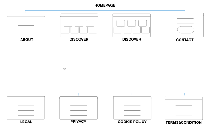
Next, I created an empathy map to visually understand the users and their needs. I discovered that my target users are looking for a streamlined website that is straight to the point and does not allow them to click through many screens. They are busy, dedicated, and hard workers who need a quick solution to fuel their mindset unlike the apps and current websites out there. I also discovered that every participant I interviewed tends to get distracted by their phone and would rather utilize a screen monitor to listen to focus music. Based on my findings, I then started an audit to understand that components competition was included in their architectural design to get a sense of what I should include in my designs that I would then test in a paper wireframe series and low/ high fidelity.
After the audit, I also researched through scientific journals the different stages of meditation and what each represents on a cognitive and emotional level: gamma, beta, alpha, theta, and delta. This information was then described further on the website.
Pain point 1: Navigation
Meditation site designs are often busy, which results in confusing navigation and an overwhelming amount of options.
Pain point 2: Interaction
Too many words on the screen take away time from the user to focus on productivity and work. They are also Zoom-based and often have users redirected to 3rd party platforms.
Pain point 3: Experience
Online meditation websites don’t provide an engaging browsing experience as there is typically only a plethora of text versus iconography queues.

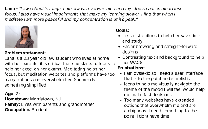
Personas:

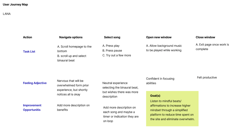
User Journey
Ideate
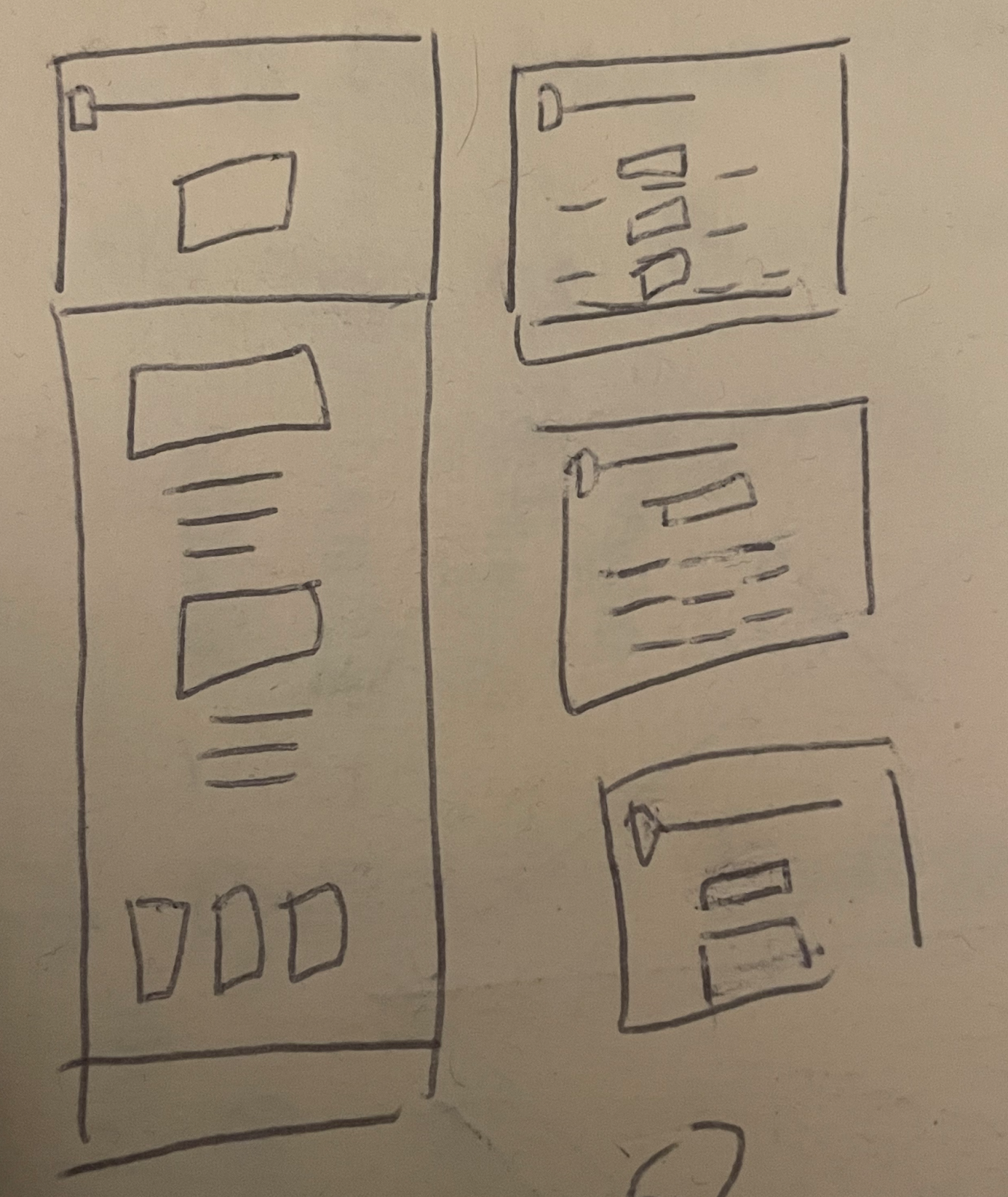

The first step I took was to create a series of paper wireframes to analyze my design ideas. It went through a series of two iterations after my first low-fi wireframe was created. Throughout this process, I had to create an interface that reduced the number of clicks the user would take to get to their point of desire. Something I added was a play/ pause pop-up integrated into the design interface versus having a separate page for each song.
After my designs were completed, the users in the study confirmed that my designs were simplistic and achieved their task completion at an exceptional rate.
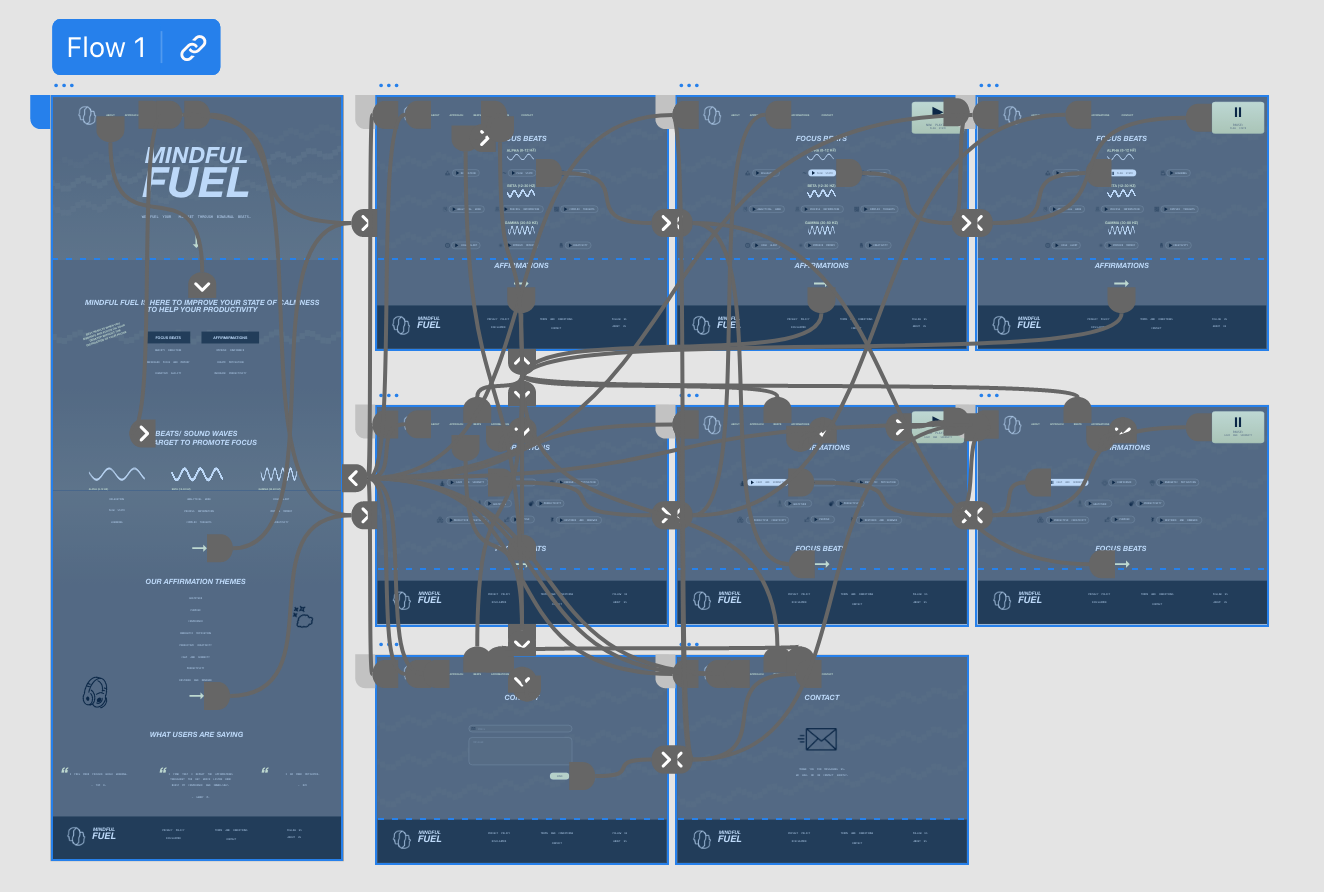
To create a low-fidelity prototype, I connected all of the screens involved in the primary user flow of accessing beats/ affirmations and the contact page. Because of the simplicity of design, there is not much wiggle room for creating multiple screens.
Findings:
- The users felt like the home screen should have more content on the home screen to describe the benefits of the service.
- The users wanted a time stamp and icons to help them identify the mood they were going to feel once listening to the meditation. Some unclarity.
- The contact page should be as straightforward as the binaural play page.
Wireframe Iterations:
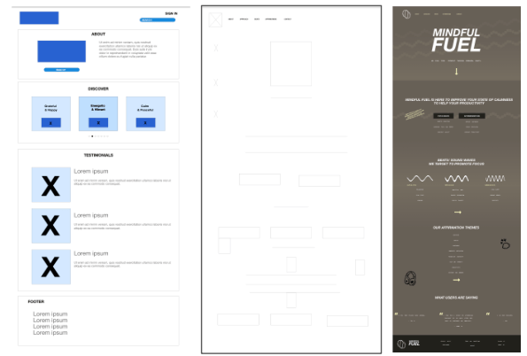
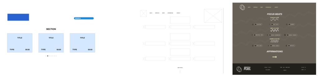
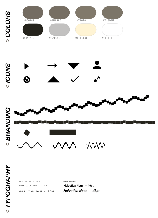
Design System Style Guide
Solution + Takeaways
Accessibility: I used contrasting text and background colors for buttons; I used landmarks to help users navigate the site such as arrows; I designed the site with icons to help users who have visual impairment to help them identify a differentiation.
Our target users shared that the design was ideal as it reduced screen time giving them more time to focus on their work. There was also a clear demonstration of visual hierarchy and organization among the songs. Overall, I learned that users want the least amount of distraction. It is better to be straight and to the point while also giving the clarity of navigation.
To view my prototype please click here or contact: alexacucc@gmail.com
Next steps: Identify any additional areas of need for the music platform.
