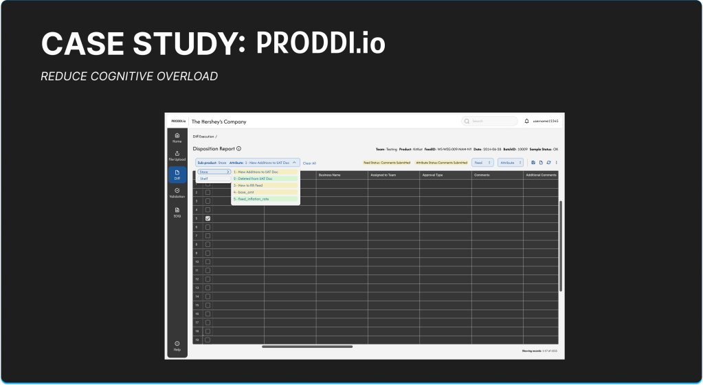
About PRODDI.io
PRODDI is a technology solution for D2C services that overviews the User Acceptance Testing lifecycle, helping clients see if their solutions meet their requirements prior to production and deployment releases. The PRODDI platform allows users to make comments on feeds generated by their cloud enterprise-grade warehouse system, PR2, so they can prepare for Quality Assurance (QA) Testing, UAT Readiness Sign-Off, and Pre-Production Handoff.
The most crucial part of PRODDI is within its Diff process where users need to review up to one million sets of data from changes in code regarding new features, bug fixes, and other modifications to enhance the feed processing. This is meant to mitigate erroneous inputs with in code and promote accuracy, consistency, and reliability in Infinitsource systems. Users need to review changes to the product scope like new features, bug fixes, and code modifications, and push into the development lifecycle for validation of feeds for end users to approve.
Challenge
- Reduce Disposition page cognitive overload
- Improve data quality review downtime by at least 75%
Problem Statement
Users of the PRODDI platform face significant cognitive overload on the Disposition page during the Diff process because of complex and unclear navigation, poor hierarchy, too may external third party platforms to record work, confusion on how to report completed work back into the system, and lack of real-time feedback. This creates friction in identifying relevant changes related to new features, bug fixes, and code modifications, slowing down data validation and UAT readiness. We need to streamline the review process to enhance data quality assessments and decrease downtime by at least 75%.
My Role
I was the UX Lead, taking ownership of all design features and research methodologies. I was the main point of contact for all SMEs, business heads, and developers.
The Study Group
The customer group we worked with was a B2B/ B2C wholesale food distributor. There was a total of 4 SME Business Heads that helped lead our development process, a total of 30 users volunteer to help participate in surveys, and 6 users that participated in four short-formed non-structured interviews.
Design Approach
Department Heads and Project Managers came to me with the requirement from Subject Matter Experts (SMEs) to implement tools within the disposition page of PRODDI’s lifecycle to help assist users in making actions related to the syndicated table of data taken from PR2’s initial UAT datasets and the feed and attribute levels.
In order to create the Disposition page, I needed to also understand the architecture of the current flow and edit the total system to streamline the process for users. I reviewed the process flows on my own time and made First, documented every page in a workflow on FigJam. Then, I had a meeting with stakeholders to understand their needs. They came to me saying that after years of issues, they wanted the new Disposition reporting to be focused on the following:
- Dashboard reporting, filtering views through AG Grid/ Angular and export file type options
- Review timestamps, user activity, and system, updates for data accuracy and quality
- See the status of reports and submissions, check file ownership, comments, and state of flow
- Implement an audit trail and version history application to see previous versions and flag inconsistencies to help update warehouse server codes to reduce error
- Contextual information of processes and tooltip details
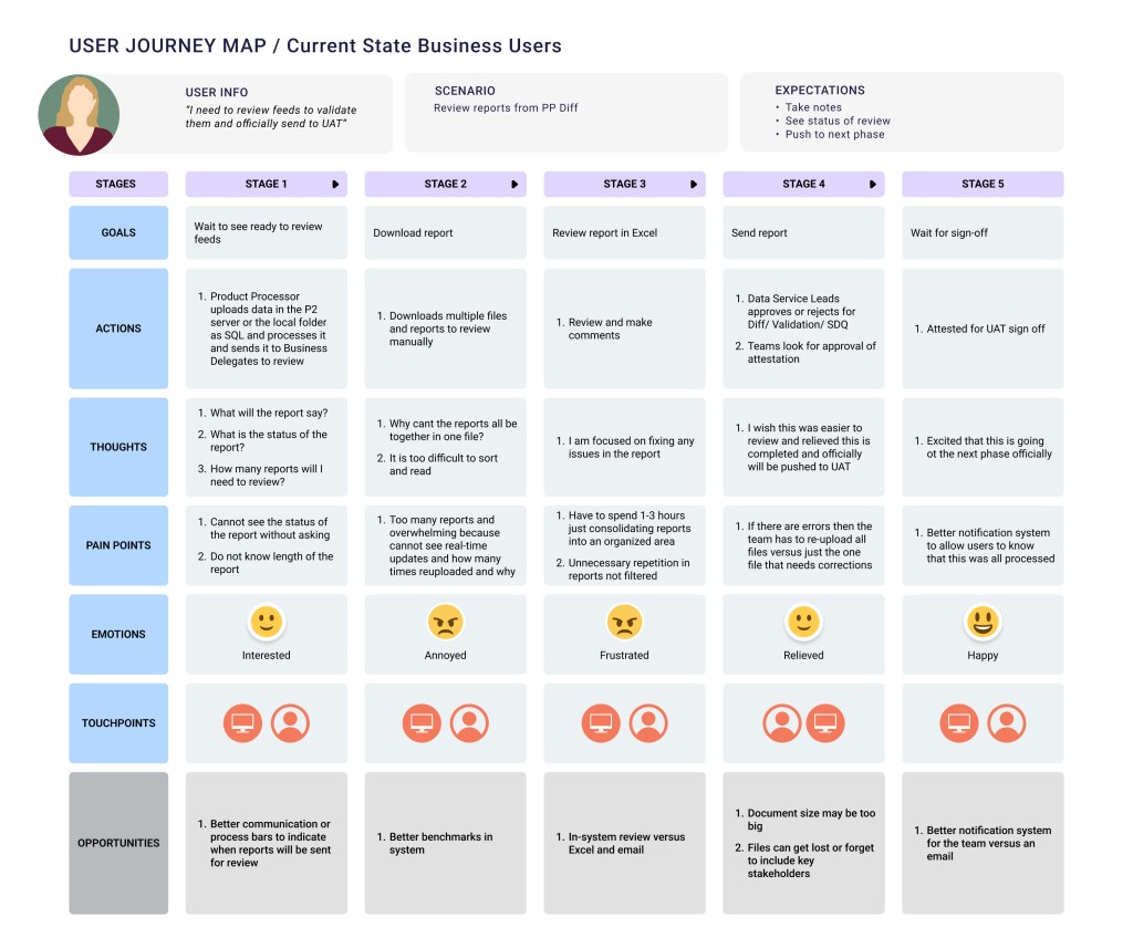
In order to help me create realistic user journeys for the new flow, I started my design process with research to identify personas from 1,000 users and key user pain points to guide my journey mapping. I came up with a list of 10+ different user names and types within the directory, I identified all of the key flows, mental models, goals, and pain points. I found that most of them shared nearly identical workflows, so I consolidated them into three personas to reduce redundancy, dilute our focus, and focus on the most impactful use cases in the designs. We discussed statements for each user type (I am/ trying to/ because/ which makes me feel), general tasks we want them to complete, and limitations they might have.
- General Users: business heads, testing teams, non-specific use case users
- Needs: high-level insights, real-time data updates, trends, data point flags, easy filtering, simple UI, easy navigation
- Business Users: product processors (data warehouse users, source teams, data management teams, testing coordinators, management leads), delegates (attestation reviewers)
- Needs: review and correct data, run validation rules, monitor submissions, monitor statuses, track failed uploads, re-run file reports, attest files, verify data accuracy and approve or reject disposition reports
- Admin Support
- Needs: help with overall support: troubleshooting, system maintenance, audit tracking, uploading files


Click photos to view details
Discovering the Initial Design
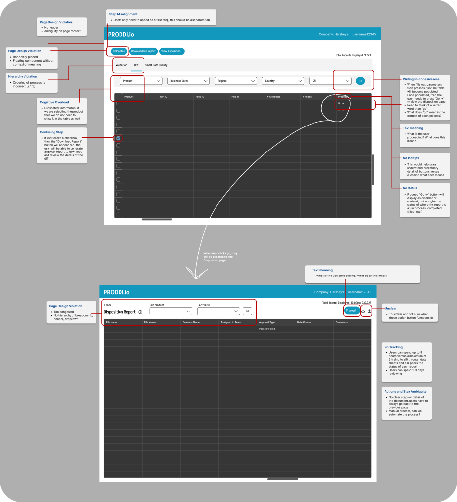
I began an audit of the initial design independently first, then sat down with SME’s to understand the business objectives, design goals, and pain points that are addressed by legacy users. Overall, I discovered that the working design did not have the supported tools to help the users perform important tasks. Below is the initial audit where you can see the lack of page clarity, no statuses, absence of number of records indicated, lack of action buttons to help initiate the disposition, and no distinguished pages in a menu bar for each pre-certification step.
The redesign process of all of the flows and new design system took a span of 8 months because of the user research projects, design audits, additional attributes added, development timelines, and testing. I conducted 6 separate white boarding sessions to review each current workflow and page with a wide range of users and one survey from 30+ users. After I got all of the feedback, I had a white boarding session with SMEs and business leads.
Pain points themes from user interviews:
- Upload history page is too confusing
- Does not display why files were failed and takes 10+ people to spend 8+ hours to investigate
- Nowhere to see the status of each stage in the flow
- Need to see how many files were re-uploaded through filtering and the status attached to each
- The results page is confusing and cannot understand the acronyms
- Issues navigating the history page
- Admin support is not always available and users cannot figure out procedures on their own
- Too many files in one area and wish that there can be a separate page to only display files
- Takes too long to review and upload reports
- New users do not even understand the manual
- Homepage graph is difficult to understand
- No timestamps makes it unclear when certain feeds were uploaded and worked on
- There are too many clicks users have to make to go back and forth to see Diff reports and the upload page
- Need a better way of uploading files and this should be in a separate page
- Needs a tracker to see how long project has been worked on
- “Too much data condensed into one area”
- “Hard to keep track of everything”
- “I don’t even know how to review the statuses”
- “It is super painful navigating”
- “Not user friendly or accessible”
- “Need a clearer way to display feeds”
Suggestions:
- Definitions of meanings
- Columns to have more details about teams
- Better alerts and notifications
- Color coding for statuses
- Eliminate jumping between history and execution pages
- Separate pages for diff, validation, and SDQ
Metrics:
- 1-3 days to just organize reports and view them
- 1-3 hours just to collect and download reports then sort them in
- Excel before even reviewing the files
- Re-upload files 10x but cannot see the initial issues as the failures and this wastes time
- 10% of files uploaded manually because system cannot read auto-upload correctly and can take up to 30+ minuets
- 3-6 sub-files related to each feed and have to switch back and forth execution and history pages to identify them
- 3-4 days spent in communication with teams just to understand the status of files
Survey pain points and suggestions: (Some of the results in our survey might have been skewed due to the nature of the questions and users answering the questions.)
- Redundant information
- Cannot comment directly on the platform
- Too many limitations in getting 100% of accurate data to review
- Unnecessary blank pages
- Navigation between pages is not easy to follow
- Functionalities are not clear
- Communication is difficult
- Need more details in the table
- Better tracking of feeds
- Area to place comments and see details of statuses
- Need to improve the look and feel of platform
How Might We (HMW) Audit
After taking note of the first white boarding session with all of the notes in our FigJam document, we created an audit of how we should fix the most repeated issues and then sorted each sticky note under the HMW statement.
- Collaboration and communication
- HMW provide real-time error controls for data uploads/ downloads in order to reduce business risk and increase productivity?
- HMW help users visualize their progress for each feed/ file?
- HMW create better management in system to help users navigate who to communicate with regarding new steps/ procedures?
- HMW implement automation to reduce clicks?
- Upload File
- HMW remove unnecessary steps and reduce clicks?
- HMW structure the flow of uploading a file seamlessly?
- HMW introduce a section to show the success/ failure of uploads and action buttons for next steps?
- HMW provide clear actionable icons for validating and pushing feeds to UAT?
- HMW monitor feeds through their workflow steps to help users understand when issues occur?
- HMW reduce re-uploading successful files in feeds with files that contain one failure file?
- View data
- HMW improve the way metadata is shown in the platform?
- HMW reduce page clicks and navigation?
- HMW include filters to help users reduce time spent searching and reviewing data?
- HMW include charts and graphs to help users visualize data?
- HMW ensure the system captures meaningful data and remove default values?
- HMW improve document search so users can reduce time spent making comments and validating reports?
- Approve and validate feeds
- HMW create an area for users to select columns to compare sample feeds of over 1M rows to mitigate errors?
- HMW allow users to view all approvals current status so they can prioritize what actions to take?
- HMW improve reporting so feeds can be sent to UAT for certification and there will be no backlog of overdue documents to review?
- HMW remove unnecessary steps within approving feeds?
- >>Themes:
- Collaboration and communication
- Toasts, modals, calendar view, statuses, progression bars, information in tooltips
- Approve and validate feeds
- Alerts, notifications, status tracker
- Errors
- Toasts and hint text
- Navigation
- Hyperlinks, tabs, filters
- Jargon
- Tooltips
- View Data
- Different pages for different files, search page, dropdown to see files in each feed and status/ timestamp
- Upload Files
- Release schedule
- Collaboration and communication
Though the white boarding session SMEs also states to me that they need to add (#) components to the platform, listed below.
- Information on report meaning (1)
- DESIGN SOLUTION: We decided to utilize an icon with a tool tip
- Option for user to select from certain feeds and attributes (Number for each varies)
- DESIGN SOLUTION: Drop down or taglist with a nested menu can be an option
- Feed and attribute statuses (11)
- DESIGN SOLUTION: Badges
- Feed and Attribute actions (7)
- DESIGN SOLUTION: Buttons with or without training icons or split button with menu
- Table related actions (10)
- DESIGN SOLUTION: List of icons
- Display user types (3)
- Total files displayed (1)
- DESIGN SOLUTION: “Showing #-# of # records”
After the persona session, interviews, surveys, and HMW statements were completed, I had to organize a list of user actions that were a part of the Disposition reporting. I soon realized the whole system was broken. Every single flow was related to the Disposition. We needed a whole entire new system to add the Disposition reporting flow because PRODDI was too flawed. It was ultimately impossible to generate useful work. There were deep-rooted structural problems that a quick UI audit was unable to fix.
Once I dug deeper into the pain points, I realized that the whole foundation of the platform needed to be redesigned.
We had one more final white boarding session to review all sticky note cards and divided them into two sections with sub themes: (1) pain points: pages, communication & (2) Improvement suggestions: pages, communication, interface and navigation. We checked ✅ topics we wanted to consider and crossed out ⛔️ sticky notes that were irrelevant within this session to give us a better understanding of what to focus on for our MVP based off the wholesale retailer’s grocery warehouse. Some of the new improvements involved better navigation, creating more intuitive conditions, adopting internal communication to assist all pain points.
Goal Refinement
With about 20 new flows to display in the navigation of the product, it was imperative for us to identify the most important attributes to prioritize on each page. We want to make the page streamlined and intuitive, allowing users to flow through each step with ease and minimal effort. The seamless process of assessing collections of data allows the user to successfully process UAT data for pre-certification.
Timeline:
Over the span of 8 months, we generated various prototypes that we put into usability testing with SMEs and other daily users who were conducting disposition reports. These testing sessions provided invaluable insights into user pain points, gaps, and inefficiencies. Within the bi-weekly sprint cycles, we divided our work into three themes: research, design, testing. We spent two months gathering requirements and learning about the display of similar components on other platforms, five months designing and prototyping, and one month on testing and finalizing designs. We adjusted priorities along the way to ensure our users were going to receive the best outcome. I worked closely with engineering teams to evaluate technical feasibility, eliminate constraints, and code efficiently.
Phase 1 Designs & User Journey Interviews for Disposition
I went through four design audits for our MVP, each time interviewing out initial 6 users throughout the process to listen to their feedback and make adjustments to the design. Each time – iterating and refining the user experience to minimize extra clicks and steps, and streamline the process.
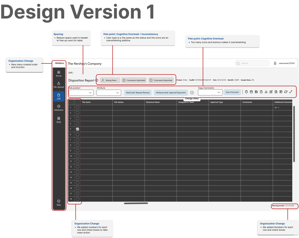
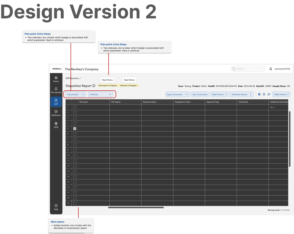
Our first design audit was a huge improvement from the legacy system.
We presented the new UI prototype to the group of 6 users who gave us comments to think about for the overall platform. You will see the design details for the Disposition page in the images below the list.
- More filters and columns to be added to the Home page
- Make Jira hyperlinked
- More detailed columns
- Filter by team or product, hates going to excel
- Display root cause of a failed file
- Include error messages when failure upload
- Reduce icons because there are too many and it can be overwhelming
- Use a dropdown to display details of files
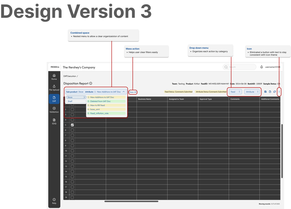
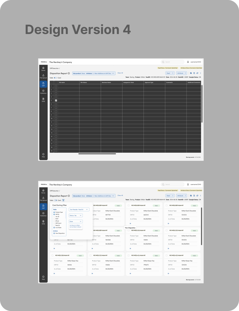
Our second design audit focused on reducing steps and adding more space to visualize the table. Our third design audit created a nested menu to reduce space, added segmented buttons for certain actions associated with specific steps, and freed up space to reduce cognitive overload. Finally, our last audit was adding a variability toggle to the design to give users the options of viewing the table in a card view. The goal of this is to help users process chunks of information easily and reduce eye movement and cognitive fatigue from scanning table columns and rows.
Quantitative Results
Error rate dropped to 1% and saved the organization an estimation of $XM+ because the new system stepped away from using third party external resources (Excel, notes apps, and emails) and consolidated all functionalities into a single application, aligning workflows in a unified control process for data review. Users were better guided to prevent mistakes and offer feedback.
- Clear information architecture and layout helped group related fields and elements logically through hierarchical guidelines
- Descriptive labels and instructions help users input more accurate data when they understand what is being asked
- Real-time validation and feedback to show statuses of errors immediately and confirm when dispositions are correct
- Auto-fill defaults, use of dropdowns to structure input to reduce human error input
- Automatic work saved for all users to see to prevent repeated actions or accidental data loss
Outcomes
- Time spent researching the status of given feeds and attributes went from an average of 15-20 minutes to two minutes.
- 60% of users said that the first iteration of designs page was less overwhelming and could perform their tasks effectively.
- 100% of users were pleased with the designs after the final iterations.
- Overall business benefit: although the Disposition is only shown in the context above, the re-design of the platform has caused a reduction of time in certifying the overall feeds by eliminating cumbersome workflows, sign-offs, and external communication. Certification time has now went down from 3 to 2 weeks. With 1,000 users with an average of $60 hourly rate, the organization has been able to cut down 2,400,000 per week saved on each project or $28,800,000 a year.
