📊
About Tide
Tide is a compliance and regulatory tool that aligns with Solvency II, a regulatory framework in the EU for insurers. Solvency II ensures that there is enough capital during times of financial stress. Solvency II requires Quantitative Reporting Templates (QRTs) and Solvenncy and Financial Condition Reports (SFCRs) to regulators and the public.
Tide is a solution developed to help identify changes in reporting metrics and disclosures through diff (data differencing), ensure that outputs meet regulatory formats and logic rules in validation, and ensure high-quality sources of data are correct and credible for auditing in SDQ (source data quality). If there are reporting failures, then there will be regulatory penalties. Users in the platform track and justify changes in reported financials or models between reporting periods to see why Solvency Capital Requirements (SCRs) changed, validate consistent data submissions, and also check to see if underlying data is accurate, complete, and appropriate.
Challenge
- Add more information
- Improve data visualization
Problem Statement
Users are experiencing cognitive underload and are experiencing mental gaps, causing frustration and fatigue when they use the platform. Users need to navigate through the platform to discover the answers to succinct information not present in the dashboard. If there is incomplete data being displayed, then users also experience cognitive dissonance and have discomfort using the platform. We are worried that this can lead to “Information Foraging Theory,” where users wander through the interface because they are unsure where to dig deeper for data in specific warehouses. Current data hides important data that needs to be brought to the surface.
Additionally, business heads who heavily utilize the dashboard find that the home dashboard displays key data with minimal visual cues, leading to difficulty understanding completion statuses across months, products, and sub-products due to a lack of visual hierarchy, color-coded feedback, and contextual cues. Users want to adopt pre-attentive processing and visual chunking to easily spot statuses based on product lines. This will also promote Gestalt principles of proximity and similarity from visual grouping and style layouts.
Current Design
- The header and sub-header are lacking visual hierarchy
- W2, a key warehouse, is not displayed in two cards
- Release status columns are not in process order, and in-progress numbers are not easily distinguishable from dispositions not started

My Role
I was the UX Lead, taking ownership of all design features and research methodologies. I was the main point of contact for all SMEs, business heads, and developers
Study Group
There are two user sets that use the platform: Data Quality Actuary Analysts and Risk Managers. They validate and monitor SDQ reporting and oversee trends and risks in reporting. They analyze data on a daily basis and create high-level real-time updates to Managing Directors and other business heads. They essentially have the same tasks.

Design Approach
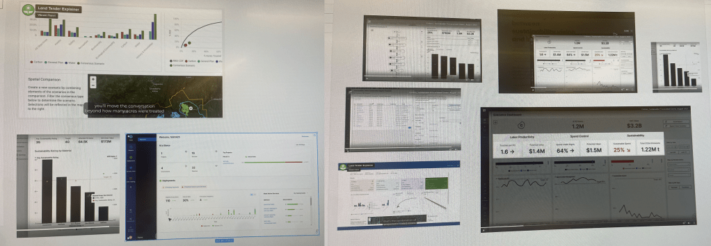
The MVP of the homepage was a result of my identification of pain points from the initial structure of the platform PRODDI.ai. Tide did not have an organized page structure and lacked a dashboard landing page. Our users did not even know that they needed this, so my challenge was to convince our Product Manager and Business Heads that we needed a page. I gathered screenshots of similar data comparison tooling platforms on the internet from tutorial videos and demos, and presented them to the teams to convince them that we should start the design thinking process of creating a new page to put into development. See screenshots below from our analysis before making the presentation.
After we agreed to start the design process, I started my discovery phase. I met with our Product Manager to get a better understanding of what is important for users. I then looked at old notes from my initial product redesign to see why Analysts and Managers need to create certain reports, and for whom. We came up with this list:
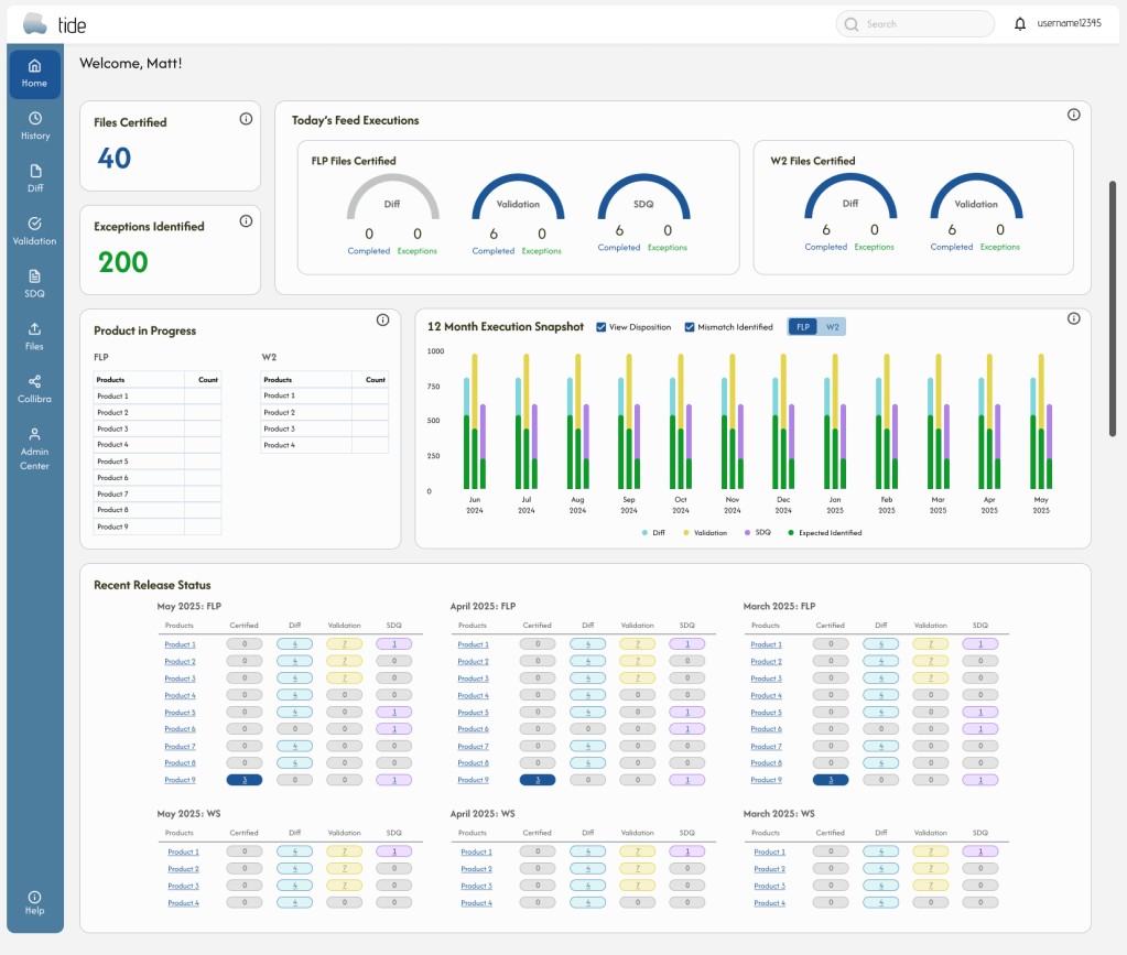
- Executions at a glance
- In progress products
- Completed and failure counts
- Ability to see daily, weekly, monthly, and yearly audits
- Release statuses for last three months
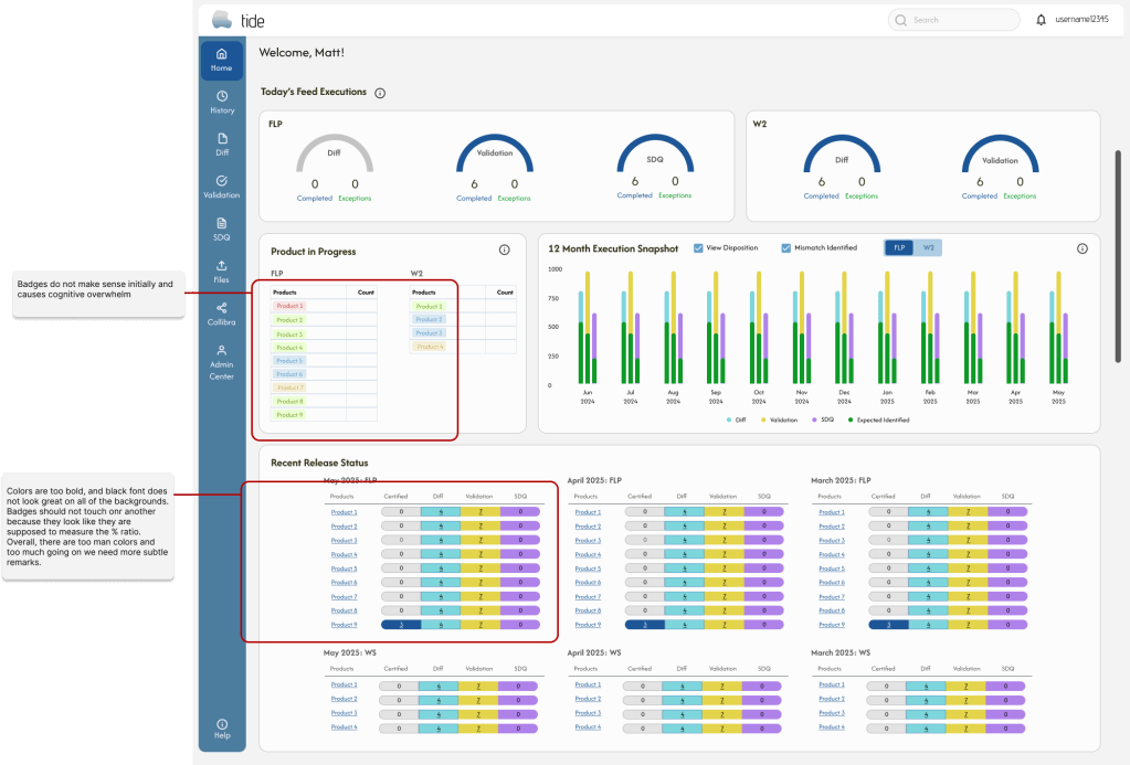
Mental model mismatches occur because the users are expecting the dashboard to work a certain way. Technically, the product statuses are not a part of our design system, and users are used to buttons/ badges having the same framework. We edited them for the final design.
Final Design

Leave a comment